Disco Forklift Truck and The Portman Group
You might have seen that the Portman Group recently upheld a complaint against Disco Forklift Truck. We invested a lot of time compiling reasoned and well-researched responses to the complaints; regardless, they were upheld. We’ve taken that on the chin - we kinda have to, given the threat of removing our product from sale in supermarkets based on the complaint being upheld. We’re not in a position to thumb our nose at the Portman Group on point of principle; the likely sacrifice of a huge chunk of our turnover would at best mean we couldn’t go ahead with some of our exciting new projects, at worst we’d be looking at losing team members. I wanted to write this to get some of our points across, because dealing with this complaint has left us hugely frustrated, and downright confused.
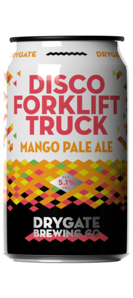
Without going too far into the nitty gritty of our argument, the complaint was upheld on two grounds. One - that there was an association with bravado based on the character dancing on the raised forklift arm, and two - that there was a particular appeal to under 18s. The first point we’ve accepted. I can see the logic in the argument that somebody dancing on a raised forklift arm is not something to be recommended (even if the somebody in question is a disco-dancing spaceman on an alien planet).
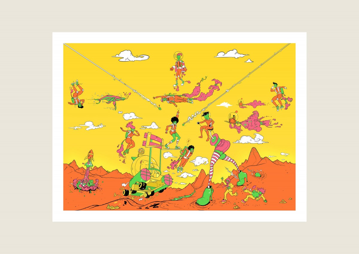
The second point is the real head-scratcher. The panel concluded that “the combination of colours, the language used, and the nature and behaviour of the cartoon illustrations, on a 330ml can, meant that the product did have, however unintentionally, a particular appeal to under-18s.” We addressed this, point by point, in our response. If you're already thinking "TL;DR", believe it or not, this is an abridged version of the conversations we've been having with the Portman Group over the past six months.
There may be some evidence to suggest that bright colours are attractive to younger drinkers. But they’re also attractive to older drinkers. We’ve used bright colours to be reflective of the tropical nature of the flavour profile, something which is common in design language for all products, alcoholic or otherwise.
The language we’ve used for the tasting notes which the panel drew attention to (‘mango’, ‘fandango’, ‘tropical’, ‘juicy’, ‘fruits’ and ‘sweet’) are so commonplace for tasting notes on other alcoholic products that I gave up finding examples of them after filling 3 A4 sheets of paper. With the obvious exception of “fandango”, which was used because it rhymes with “mango”. And the beer has mango in it.
With regards to the “nature and behaviour” of the characters, the scene is sci-fi based. It takes place on an alien planet. It’s supposed to be fantastical. There are little green men with jetpacks. There are disco dancers. It’s supposed to be kitsch and reminiscent of the golden age of sci-fi and disco. These are not exactly current cultural touchstones for the youth of today. It’s supposed to have appeal to people for whom these are relevant cultural motifs; people who grew up with disco and sci-fi and have grown into adults who still enjoy these things. Given that we’ve put no marketing budget behind it (or anything else we brew for that matter) and it’s become our most popular beer, I’d say that’s pretty strong evidence for the fact that the “particular appeal” it holds is for exactly the sort of people it’s intended to be for. The only things we’ve been asked to change in this regard, is to reduce the number of characters and to make them less happy. Look forward to seeing a bunch of morose disco dancing aliens on the reworked design soon…
And on the size of the can, shouldn’t we be encouraging drinkers to drink from smaller pack types? The panel noted that to children, 330ml cans are synonymous with soft drinks, despite adults increasingly recognising them as the pack type of choice for craft beers. I understand this, but don’t understand what the logical extension to this argument is. If everything else on the can suggests it’s a beer, surely even a child could be trusted to make a reasoned decision on whether or not they should drink it?
We want the Portman Group to protect potential underage drinkers. But there’s no evidence to suggest that our product is a major risk of attracting underage drinkers, or that underage drinkers have ever chosen to drink our product. Meanwhile, complaints against products which are notorious for being consumed by young people, have not been upheld. That would suggest (to me) that the Portman Group might need to rethink how they judge whether a product is particularly appealing to under 18s. I would suggest that they take into account the things that actually attract young people to alcohol brands; price point, alcohol content and flavour profile. That way they might be able to differentiate products which appeal to underage drinkers in the real world from those that don’t. A bright can with cartoon-like characters is not enough to appeal to an underage drinker if the product inside the can is not appealing to them.
We understand what the Portman Group are fundamentally trying to do, but we can’t help feeling singled out. We’ll change the design, in the strange and minor ways that have been requested, although we can’t help feeling like it’s pointless. But the biggest thing we’ll take from this process is that this regulatory group are having a disproportionate effect on creative and innovative craft brewers, and we can’t help feeling that this sucks.
Matt Corden
Managing Director
Drygate Brewing Company
THE BEER EVERYONE IS TALKING ABOUT!
More Articles
VIEW ALL BLOG POSTSOur new Zero-Waste Food Menu & Beer
Businesses like ours could be doing much more to lessen their impact on the environment - that's why we're getting involved in Plate Up for Glasgow.
26th August 2021Our Last NPD Update of 2020
Our final update of 2020 - thank goodness this year is almost over! A quick round-up of our last beers of the year.
18th December 2020October Beer Update
It's time to get ready for those cold winter nights with our latest beer releases!
29th October 2020

